Hey. Hi. Hello.

I'm Ryan, a human-centered design leader passionate about the intersection of psychology and technology. I use my research, design, and facilitation skills to help organizations grow their innovation capabilities through design strategy.

About

About Me

Ryan M. Stryker

Facilitator. Coach. Human-Centered Design Advocate

I’m a product of empathy, curiosity, drive, and good fortune. Early on in my career I was afforded the opportunity to grow, hone, and lead Interaction Design, Visual Design, and Front-End Development projects, but I was left frustrated by the amount of questions and assumptions made about a product’s user from within agency walls. I wanted to better understand end-users, but also help stakeholders use their products to accomplish targeted business goals and objectives. My desire for answers lead to an obsession with holistic User Experience, a job change, a Master’s Degree in User Experience, and a bookshelf that defies that laws of physics by holding more tech books than any shelf should.

Today my background in digital marketing and passion for software design and development, allows me to focus on helping project teams remember that the products we create are meant for real people with very specific needs, wants, and frustrations. I’m motivated by helping clients and peers alike understand the strategic role User Experience (UX) provides and the value that user research and usability testing can bring to their projects by validating both the assumed problems and the solutions we think can solve these problems.

In the end, I’m just doing my part to put the "user" back in User Experience.

Personal Skills

Tennis60%
Coffee Brewing80%
Home Improvement90%
Pet + Plant Parenting75%

Professional Skills

User Research85%
Workshop Facilitation95%
Product Design80%
Estimation + Scoping90%

Tools

  • Mural, Miro
  • Adobe Suite, Sketch, Figma
  • HTML, CSS
  • Invision
  • Office 365

Methods

  • Storytelling
  • Design Thinking
  • User Interviews
  • Design Sprints
  • Usability Testing

Education

  • 2021 - 2023

    Luma Institute

    Instructor Certification
  • 2013 - 2015

    Kent State University

    M.S. | UX
  • 1999 - 2004

    Mount Vernon Nazarene University

    B.A. | VCD

Experience

  • 2023 - Now

    Insight Enterprises

    Pre-sales Strategist
  • 2020 - 2023

    Insight Enterprises

    National UX Architect
  • 2017 - 2019

    CoveryMyMeds

    UX Manager

Testimonials

Services

What I Do

In my current role I lead cross-functional teams through early-stage product discovery and strategy. I leverage workshop faciliation combined with user research and design thinking methods to help organizations identify innovation opportunities for market testing. I would love to collaborate with organizations who provide products and services in the mental health, inclusion, and neurodiversity industries.

  • 01

    Workshop Facilitation

    As a LUMA-certified Facilitator and Instructor, I can plan, facilitate, or moderate remote or in-person workshops.

  • 02

    User Research

    Able to provide full-spectrum qualitative research methods, including generative and evaluative research and synthesis.

  • 03

    UI Design

    From low-fidelity wireframes to high-fidelity design concepts, I can help ensure the UI meets the specific tech & brand requirements.

  • 04

    Usability Testing

    Whether formative or summative studies, heuristic evals, or a SUS, I can elicit the quantitative data about user behavior needed for product planning or evaluation.

  • 05

    Product Strategy

    I guide stakeholders & techincal teams through product discovery and definition to evaluate, prioritize, and plan the product roadmap for new products & services.

  • 06

    Experience Mapping

    Processes, stories, user journeys - they all have their place. I help create clarity through visualization and alignment between people, places, and things for an inclusive view of the product ecosystem.

Noteworthy Clients

Fun Facts

  • 15

    Plants Kept Alive
  • 05

    Coffee Brewer Methods
  • 04

    Years Of Tennis Lessons
Portfolio

Creative Portfolio

News

Latest Musings

I love to write, but rarely make time for it. Most of my work is published elsewhere, but I will be porting over content during the coming weeks. If you're interested in co-authoring, please use my Contact Page to collaborate.

  • As someone who prefers in-person research methods, I never imagined the speed at which organizations would pivot and thrive with virtual collaboration during the pandemic. Teams are meeting and collaborating remotely using digital tools with ease. And digital collaboration platforms like MURAL have excelled at providing unique ways for facilitators to conduct participatory activities with their teams or clients.

    As a LUMA Institute Certified Facilitator (with almost 100 workshops under my belt since the pandemic began), I have access to proven methods to help ensure a successful workshop. But even the most skilled facilitators face moderation challenges like barking dogs, frozen video, and random appearances by family members. Yes, these disruptions have become the norm — but when participants continue to be distracted or disengaged, facilitators may need to pause and ask themselves if something deeper is going on.

    THE HUMAN FACTOR
    Once while discussing a disengaged team member, a former manager told me, “We expect teammates to show up, but what we get is people.”

    It had a profound effect on my approach.

    By assuming our personal lives should not affect our work, I wasn’t creating space to learn and make mistakes. More importantly, I wasn’t providing an environment where we could reach out to others when we struggled and needed help.

    This revelation helped me be more curious about why I wasn't getting what I needed from my team and allowed me to strive for more transparent, vulnerable conversations. Understanding where we could speak up, share feedback, and learn from our mistakes reduced unnecessary friction. Everyone could contribute authentically or leverage others to meet their needs without constraints.

    While we didn't realize it at the time, the environment we were building as a team leveraged aspects of psychological safety.

    "Psychological safety is a condition in which human beings feel (1) included, (2) safe to learn, (3) safe to contribute, and (4) safe to challenge the status quo — all without fear of being embarrassed, marginalized, or punished in some way. The 4 stages of psychological safety are a universal pattern that reflects the natural progression of human needs in social settings. When teams, organizations, and social units of all kinds progress through the four stages, they create deeply inclusive environments, accelerate learning, increase contribution, and stimulate innovation."

    Quote Source: Leader Factor

    This experience led me to a new realization: The same traits that make psychological safety so impactful to a team could immensely benefit the relationship between facilitators and participants (especially during a pandemic).

    If you're new to psychological safety, it may be helpful to review the Four Stages of Psychological Safety conceptualized by Timothy R. Clark. Understanding each stage has allowed me to adjust or reconsider my facilitation approach to build trust and increase collaboration when engaging with participants before, during, and after our time together.

    To bridge the gap, facilitators should begin asking, “How might we incorporate and foster psychological safety to empower participants to fully engage during our time together?”
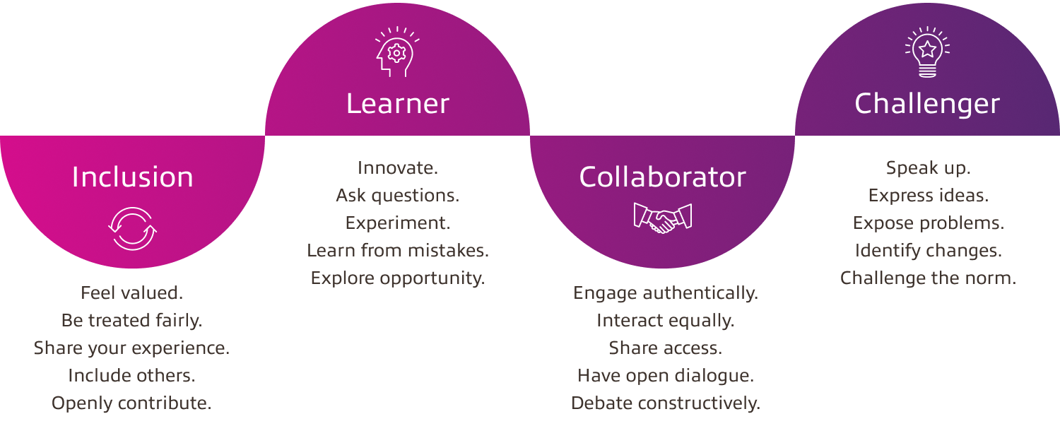
    stages of psychological safety

    INCLUSION SAFETY METHODS
    Participants may already know each other, or they may be strangers. Considering how we might help them feel more connected to each other, ourselves, and the activity can go a long way toward building inclusion safety. Encouraging this type of safety can help participants feel that their experience and ideas matter — and that they can openly contribute to the activities presented.

    To help others realize their similarities, build empathy, and enable a sense of belonging, I like to use a simple Introduction Method in which participants each have a designated area to decorate an avatar and add personal details about themselves. I stick with prompts around hobbies, an interesting fact, or a place they would like to visit and allow each person to share once they're done. You can adjust your prompts, but remember to avoid prompts that may be difficult for everyone to engage with (pop culture, culture-specific, etc.).
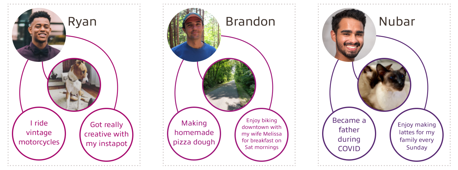
    inclusion safety method

    LEARNER SAFETY METHODS
    Some participants may work at a computer every day and have previous experience in a participatory session. Others may be tech adverse and collaborating in a group environment is foreign to them. Regardless of experience level, all participants want to learn and grow. Providing time and space to learn new things, ask questions, try new things, and make mistakes is part of the process.

    Before the session, I share a short video tutorial on how to access and use the collaboration platform and provide a link to the Introduction Method to allow participants to engage and play with the tool in advance without the pressure of the group watching.
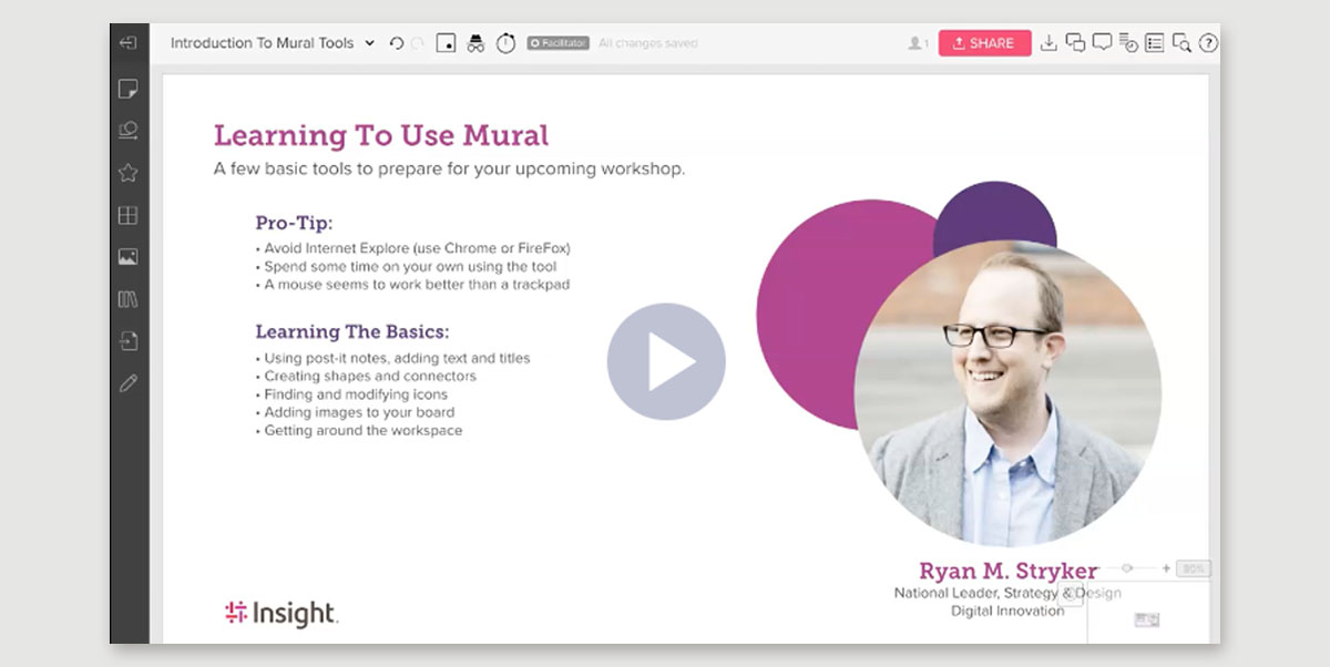
    learner safety method

    I also include information about the session, including why the participants received an invitation and what they can expect. While some may not need to review this information beforehand, others may have anxiety about the workshop. The overview and additional details can help reduce fear, increase their sense of learner safety, and increase their participation from day one.

    CONTRIBUTOR/COLLABORATOR METHODS
    Providing contributor safety means that participants feel safe to interact with each other, have open dialogue, and debate in a constructive way. To help promote this type of safety, I like to use a simple Session Agreements method. In this method, I review what I expect from the group and the workshop, as well as additional context about what makes a great collaboration session. I also have the participants provide suggestions if they feel like something is missing to ensure our time together is a success.
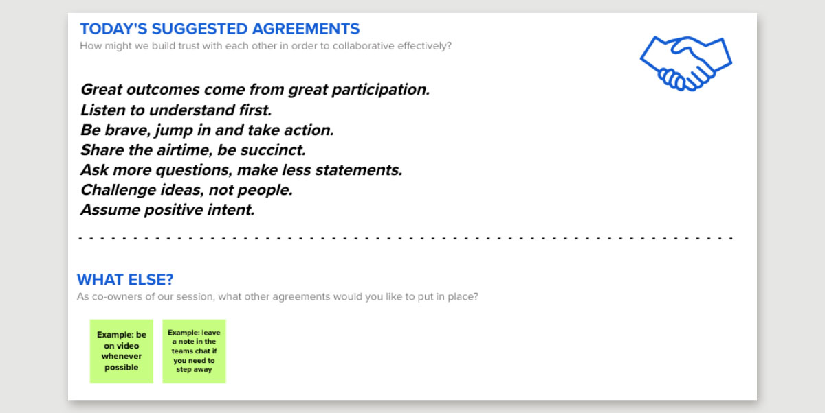
    contributor safety method

    Allowing the Session Agreements to be collaborative and asking the participants to indicate agreement provides a baseline to safely contribute and nudge others back toward safety if they move away.

    "Contributor safety satisfies the basic human need to contribute and make a difference. When contributor safety is present, we lean into what we’re doing with energy and enthusiasm. We have a natural desire to apply what we’ve learned to make a meaningful contribution."

    Quote Source: Leader Factor

    As an additional activity to create collaborator safety, I utilize a Health Check method I adapted from Invision . During the Health Check activity, each participant provides insight into their openness to a collaborative session. Participants can indicate they feel strongly for or against collaboration and anywhere in between. This level of honesty can be intimidating but has immediately become one of the most rewarding methods I use. I find this technique helpful when facilitating a workshop over multiple days, when participants may conduct themselves differently from day to day.
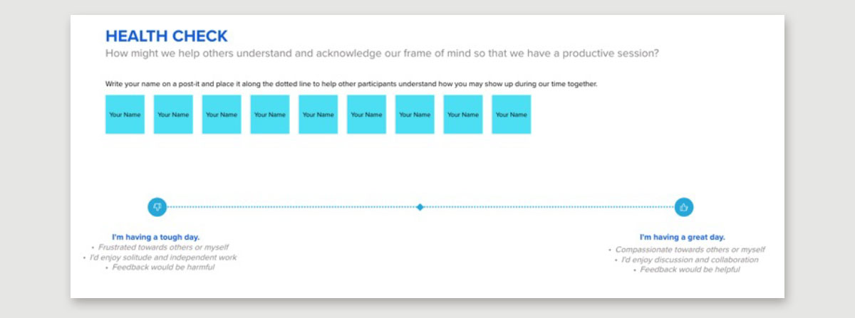
    health check method

    Note: This activity requires a fair bit of initial safety for participants to self-identify. If participants aren’t comfortable doing so, you can still facilitate this method without anyone adding their name. Simply use private mode to create anonymity of their movements and content. Using private mode throughout your following activities can be an excellent way to provide or continue providing contributor safety.
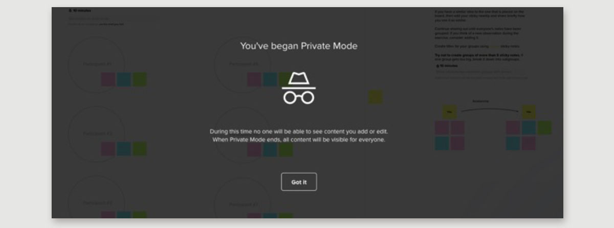
    private mode example MURAL

    CHALENGER SAFETY METHODS
    The last and potentially most intimidating stage is challenger safety. While the Session Agreements method mentioned earlier will help support this stage, challenger safety enables participants to ask difficult questions without fear of retaliation. The level of safety may lead to inspecting areas all areas of the workshop, including:

    • How well is the team working together?
    • Are we getting what we need from the facilitator?
    • Is this workshop delivering the value we need?
    • What could we do differently?

    To help foster an opportunity for feedback and discussion, I prepare an area in our collaboration space for a LUMA Institute method called Rose, Thorn, Bud (RTB). Using RTB, participants can anonymously share positive reflections (roses), negative reflections (thorns), and opportunity reflections (buds) at the end of a session. As a facilitator, I review these individually the next day and discuss the feedback with the participants openly to see what we can address to improve our time together.
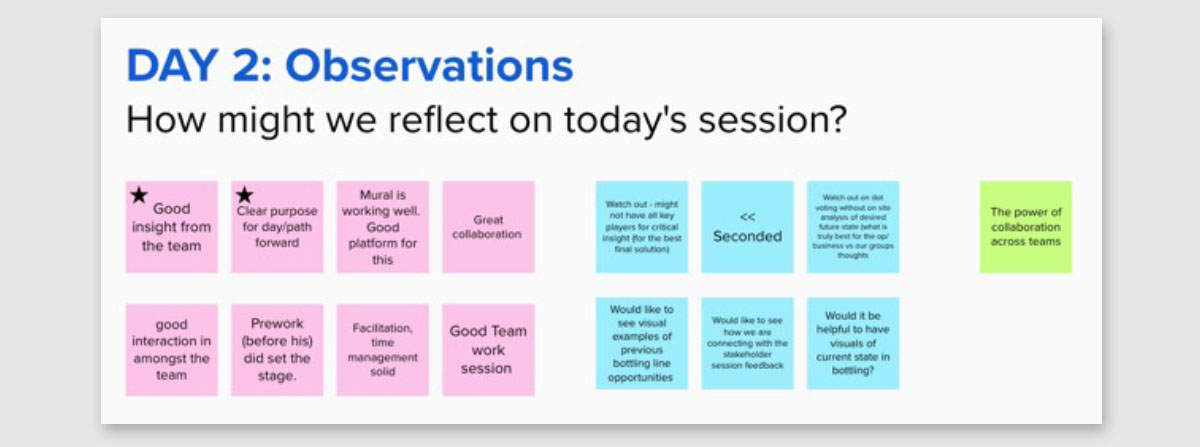
    LUMA design thinking method, rose, thorn, bud

    Whether it's your first or hundredth time, being mindful of psychological safety and using these methods together can help build a unique and welcoming session for your participants.


  • With the increasing interest in bots and conversational User Interfaces (UIs), our User Experience (UX) teams are often asked, “How can we improve the overall user experience when a bot’s user interface is oftentimes so limited?”

    In a related article, “Want to Build a Chatbot? It Takes Technology and UX,” Adam Deardurff provided an outline for leveraging a proof of concept to refine bot use cases and introduced the concept of “designing” the experience. Knowing that the term “design” can be ubiquitous, we wanted to elaborate on a few of the often-overlooked non-UI areas a UX team should be engaging on a bot project. These tips and tricks should help your teams and clients build better bots.

    Create a chatbot introduction message and clearly state why it exists/what it can help with. Is your bot there to help with frequently asked questions, access to phone numbers or bus schedules? Strive to help users avoid spending large amounts of time trying to find the specific information they need only to discover it doesn’t exist.

    Come up with a chatbot name, but avoid using your brand/company name or even a human name (we all know we aren’t talking to Karen, Susy or Jeff). This a chance to add a little whimsy and subtle hints to the user about the personalized experience they're about to have while aligning with your organization’s desired brand perception. If naming your bot makes you nervous, get someone from your marketing team to help. A fun (and well promoted) example is Dot, Akron Art Museum’s chatbot.

    chat bot profile pic - akron Dot

    Give your chatbot a profile picture, and it’s important to remember this is another touchpoint to represent your brand and positively impact your users' first impression. Skip the logo icon or customer support stock photo in favor of building a narrative around your bot’s character. This is a great opportunity to market your new bot and give it life.

    Using an illustration allows you to create a character and still provide a “face” for the profile picture a user expects to see. An easy and popular choice is to use a robot. For some inspiration, take a look at the examples we found on Google Images.

    bot icon examples

    Your communication shouldn’t sound like a robot. While you’re still in the planning phase, it’s OK to focus on identifying your conversation map (initial prompt and response options). Revisiting those touchpoints to identify your bot’s voice and tone before a user interacts with your bot will go a long way toward making a good first impression. If you’re new to considering voice and tone and how to use it in your products, Mailchimp does an excellent job explaining its guidelines and distills the concept as follows:

    “What’s the difference between voice and tone? Think of it this way: You have the same voice all the time, but your tone changes. You might use one tone when you're out to dinner with your closest friends, and a different tone when you're in a meeting with your boss ..."

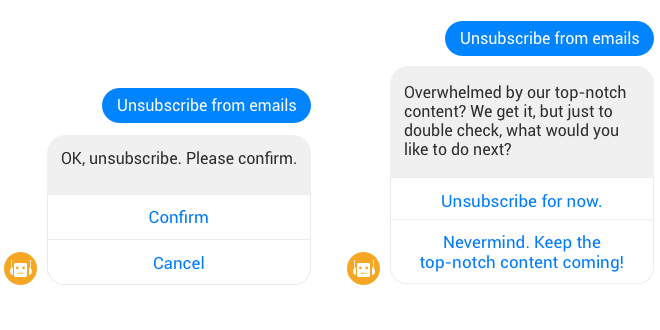
    For example, look at the subtle differences between these two conversations:

    bot language examples

    With the popularity of texting, you can also consider adding emoji (if your brand allows) to increase visual feedback and help convey the sentiment behind your statements. We’ve all experienced sarcasm gone wrong in an email or text. If your bot serves an international customer base, the use of jargon, references and colloquialisms may get lost in translation. This is where an emoji may help give added context.

    bot language examples

    If you don’t have support from marketing and don’t consider yourself “creative,” you can always do a quick message architecture exercise with your team to help define who your bot is and isn’t.

    Journey isn’t just a band; it’s the planned and unplanned path your user may take to engage with your bot. Users frequently complain they get “stuck” interacting with bots, or that a bot is “dumb,” when in reality it’s not the bot’s fault at all — the blame rests on your team’s ability to guide your user through a journey.

    Leverage journey mapping and task-flow techniques to ensure each prompt and response option is covered. Mapping out these possible decision trees will help you and your team identify dead ends and anything that strays from the “happy path.”

    An easy way to keep users on the happy path is to use leading questions (I know, I know, anyone who does user research is cringing) and provide affirmation when they choose the option you intended. Outside of journey, the form factor will play a large part in matching or exceeding a user’s expectations. Here are a few guiding questions to consider:

    • Will our bot only be used on a mobile device, or do we need to consider desktop users? What about voice?
    • What type of inputs are easiest for the user at the time of use (multiple choice, open text, number entry, voice, etc.)?
    • How can we mimic any channel-specific (Facebook, Skype, Teams, web, etc.) nuances to help reduce onboarding friction and provide a seamless experience?

    With each of these areas covered, don’t forget users still might run into a situation where your bot can’t help and they need an escape hatch. In that case, be sure to give them an option to get help outside the bot experience and reach a real human via phone, email or integrated customer service chat, etc.

    • Will our bot only be used on a mobile device, or do we need to consider desktop users? What about voice?
    • What type of inputs are easiest for the user at the time of use (multiple choice, open text, number entry, voice, etc.)?
    • How can we mimic any channel-specific (Facebook, Skype, Teams, web, etc.) nuances to help reduce onboarding friction and provide a seamless experience?

    Wrapping up, we hope these tips and tricks will provide a few conversation starters for teams building their first bot and the ways a UX professional can help improve your users' overall bot experience. Just remember: Even though a bot may not include the typical UI design focus other digital products do, several experience considerations can help your bot stand out in a crowd and increase both user adoption and satisfaction.

Contact

Get in Touch

My current role keeps me plenty busy, but I am available for smaller projects, speaking engagements, candidate screening, or coaching. I would also love to collaborate with organizations who provide products and services in the mental health, inclusion, and neurodiversity industries.

Please Fill Required Fields